Data Visualization for Social Action
Organ Donation

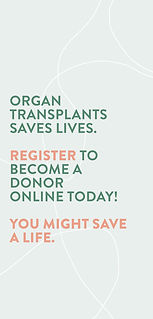
Design on Instagram story Mockup
Description of project
Data visualization communicates and represents data to viewers, further helping them understand the story behind complex information. The goal of this data visualization project aims to portray complex information in a clear and digestible way.
Analysis of Problem
The topic I choose to communicate is Organ Donation. By researching and gathering information and statistics, I was able to formulate an idea about my topic. In a recent survey (2019), I found that more than 80 percent of Canadians are willing organ donors, while only 19 percent of Albertans are registered organ donors. This makes Alberta one of the lowest number of registered organ/tissue donors in Canada. According to AMA (Dec. 2019), donor rates have dropped by 40 percent over the past decade. About 250 people die waiting for a transplant each year in Canada. When someone donates they can help more than 75 people and save up to 8 lives.
“Over 1,600 Canadians are added to organ wait lists yearly. A 90% majority of Canadians support organ and tissue donation but less than 20% have made plans to donate.” - Canadian Transplant Society
I want to highlight the statistics in a friendly and helpful manner, thus pursuing my audience to become organ donors in order to potentially save lives. This project will emphasize the importance of organ donation and how it impacts others, by the use of visuals, quotes and facts.
Audience
Through research, I found that the most common age of becoming an non-living organ donor is at the 18 to 39 age range. More specifically, males of that age are most common organ donors. This age group is the most active and are the greatest risk takers. As well they are healthy and fit. Moreover, the most common age of becoming a living organ donor is also at the 18 to 39 age range. However, there is no age limit for organ donation as long as the organs are healthy.
This research is critical to my project because my target audience is of that age range (18-39 years old) and health status.
You do not have to die to help save a life. About half of all organ donors are living donors. Living donors can donate a kidney, a part of a lung, a part of their liver, bone marrow, umbilical cord blood, blood or stem cells.It is also important to sign up as a living and non-living donor.
18 to 30 year olds
Instagram users
University students
Healthy Albertans
Tone
Friendly
Informative
Non-worrying
Deliverables and Possible Solutions
The deliverable I have chosen to design is a click through Instagram story. This project evolved from an installation work into a digital work because of the isolation caused by COVID-19. At this moment in time, I thought it would be most effective to use my social media platform, since many people are on social media, specifically Instagram. Instagram is the most common and most used app of my target audience. Further, I chose to design an Instagram story because it allows the viewer to interact with my design. Instagram stories can be clicked through at the viewers own pace, and allow for a quick collection of information. Because of this quick collection of information, I wanted my story to be on the shorter side, but still contain the important factual information. The information presented will act to persuade and motivate my Instagram followers to learn more on organ donation, and sign up to become an organ donor.
Location
The online space of Instagram.
Ideation
Moodboard
My first moodboard shows the visual style inspiration, and the second moodboard shows the research of other data visualization and info-graphics on the topic of organ donation.
Moodboard 1
Organic shape illustrations were my inspiration. I thought this style and soft colours embodied the tone I was going for with my own designs.

Moodboard 1, 11 x 17 inches
Moodboard 2
I did a lot of research on how health care and organ donation websites showed their information visually. This was important to know how they share information in an educative way.

Moodboard 2, 11 x 17 inches
Process work
My initial designs were too bright for the tone I was trying to portray. After feedback from my peers, I agreed that the pink colour came across too feminine. As well, I changed the layouts of my data visualization in order to make the Instagram story more cohesive.


Process work screens
Visual System


R: 236
B: 242
G: 238
R: 183
B: 208
G: 178
R: 66
B: 110
G: 83
R: 253
B: 243
G: 234
R: 255
B: 231
G: 209
R: 236
B: 169
G: 142
Colour Palette
Visual system shapes
Typography used in the system
Tone
Friendly
Informative
Non-worrying
Organic
Colour
The colours I chose were influenced by the official colour of organ donation, green. I chose to use pastel colours in order to portray the light hearted and friendly tone. The primary colours I chose were green and a salmon-orange. For secondary colours I chose lighter greens, salmon-orange, and white.
Shapes
I used soft organic shapes. The shapes used were abstracted forms of organs donated to save lives. I also used lines to create movement and flow within each screen. This use of line contributed to the visual system.
Typeface
The typeface I chose was Brandon Grotesque because it looked friendly, was easily read, and worked well when paired with the organic shapes. All facts and headers are in all uppercase, whereas larger pieces of information are in lowercase. This created hierarchy within the overall design of the screens. Further, the uppercase letters fit well together when closely stacked. In my initial mockups, I tried lowercase for the facts, but they did not fit well together and did not look as important as the all uppercase version. I chose to use lowercase for the body text to make it easier to read for the viewer. As well, I used colour to create hierarchy and highlight the most important parts of the information.
Screen Designs


Screens for Data Visualization Instagram story,
About
Data Visualization
Visually, I wanted my design to look friendly and light hearted, because organ donation can be a sensitive topic to talk about. Moreover, I wanted the data visualization to be simple and impactful. There was a lot of information that I could have shown visually, but I thought that would be too overwhelming for the viewer. Instead I chose to show the impact an organ donor can make. I begin by telling the viewer how many people in Canada are on the organ transplant list, then focus in smaller to how many Albertans are waiting. This gives the viewer a sense of scale. To help the viewer visualize how many Albertans are in need, I visually show the number with the silhouette of people. As the screens change, I show how one person can make a difference by highlighting the people saved or helped. Instead of grouping the people together, I chose to spread them out like they were in a crowd. This also creates movement within the screen and allows the viewers eye to move around.
Data Visualization Screens
Fact Screens
Facts Screens
After showing the viewer visually the impact organ donation has, I included facts to help educate the viewer understand organ donation.
Quote screen
I ended the story with a quote and a call to action to tie the message together.
Quote Screens
Project Reflection
This project showed me how design ideas may have to adapt to situations out of my control. At the ideation phase of the project,
I had a completely different idea of how I wanted to showcase my work. The isolation situation caused me to think outside of the box and think about physical space in a different way. I explored how I could use social media for social action. Data visualization is important and should be easy to understand at a glance. Class critiques allowed me to test my design progress. These critiques and consultations furthered my exploration with visual and textual hierarchy.