Self-Guided Art Tour
Client Project - University of Alberta Hospitals

UAH Art Tour Map Mockups
Description of project
The University of Alberta Hospitals contains over 1,800 two- and three- dimensional artworks found throughout the public spaces and meeting places within three connected hospitals: Walter Mackenzie Health Sciences Centre (WMC); Kaye Edmonton Clinic (KEC); and Mazankowski Alberta Heart Institute (MAZ). From these 1,800 artworks, the University of Alberta will be selecting 60 works to be featured in their new self-guided University of Alberta Hospital (UAH) Art Tour.
This collection of art is displayed publicly throughout the three hospitals to provide patients, staff, and families with inspiration, comfort, and distraction, and to enhance the healing experience. Emerging research demonstrates the therapeutic benefits artworks have when they are displayed in hospital settings. The research on the topic suggests an improvement in health outcomes relating to pain, depression, anxiety, distress, and blood pressure. In addition, artwork in hospitals reduces hospital staff stress and burnout, and helps destress and calm family members of the patients.
The UAH Art Tour is managed by the Friends of University of Alberta Hospitals. They are eager to support this tour and allow healing through art. “To support the benefits of artworks in hospitals, the UAH Art Collection emphasizes physical, social, cognitive, and emotional interaction between the viewer and the artwork as well as between the viewer and their surrounding social spaces.”
The Tour aims to help with the healing process of patients, destress and calm family and friends, and reduce hospital staff stress and burnout. The aim of the designer in the art tour project is to connect people to places and make their experience memorable, informative, or easier to navigate.
Analysis of problem
UAH Art Tour will be a new program at the University of Alberta Hospitals. The tour will contain 60 artworks throughout the public spaces and meeting places within three connected hospitals. This is a problem because the tour covers a large distance over the three different hospitals, so knowing where exactly the artworks are will be helpful to the people walking on the tour. In addition, the hospital floors do not line up to each other, although they are connected. This will cause trouble when creating a map brochure of the tour.
While walking throughout the hospitals, a problem was noted in regards to wall texture. This will be a problem when adhering a UAH Art Tour tag to the wall. The material that will be used in the installation will have to work on all surfaces. In regards to lighting, some artworks are in dimer lit hallways than others. This will have to be kept in mind when choosing colours and textures for print to allow best visibility.
As well, there are many art pieces on the tour (60 artworks). Many of which will be moved around and/or excluded from the art tour over time. In addition, the hospital plans to acquire new pieces to their collection in the coming years and would like to add them on the tour. This can cause a problem with the layout of the hardcopy printed map. Because of this addition, deletion and movement of artworks, the system put in place cannot be labeled by a number system. As well, the layout of the map will need to be flexible in-order to account for changes within the tour.
Analysis of the Need and Aims
The art tour is an internal project. The aim of the art tour project is
to connect people to places and make their experience memorable, informative, and easier to navigate. In the initial meeting, it was learnt that there have been requests from patients, staff and families for a tour of the artworks around the hospital.
Wayfinding is a major component in this project. The UAH Art Tour will be available in any order with a QR code provided with each artwork for further information. Alternatively, a specific tour can be followed in an order provided by either a URL link or hardcopy brochure. There are three connected hospitals with different floors. For this project, a strong and editable way-finding map is critical. The map will need to be easily understood in a visual way with additional descriptive text. Further,the map will have to be designed to consider change with the artwork included in the tour.
An additional deliverable to this project, is the signage marker that will accompany the artwork, and the artworks descriptive plaque. This signage will need to be noticeable, but not distract from the artworks. The signage will need to be associated with the art tour and be intriguing for patients, families and staff. The artworks will aim to be categorized in the different eight categories of messages and emotional responses as well as be organized by building and floor.
Overall, the tone of the art tour aims to be hopeful, lighthearted, and modern without being ‘cold’. It needs to be human centred, and connect the viewer to who they are while giving them an escape. Colour will be a strong factor in this project. Choosing the right colour combinations will attract and inspire all who come in contact with it.
Existing Solutions (pros and cons)
Currently, there are only existing ideas from the UAH Art Tour staff. The label markers created are similar to the google map drop down symbols. The pros to this solution is that it is a simple marker and reads well on a map. The cons to this solution is that it is not original to the University of Alberta hospitals. The hospitals can benefit by creating a design that is unique to their art tour. As well, the colours chosen do not relate to anything to the hospital, with exception to the red for the heart institute.
Ideation


Process Work
Concept 1
There are 4 ideations of the same logo. 1 is without a frame, 2 uses capital letters, 3 uses lowercase and 4 is similar to 2 but it is horizontal. My idea behind this logo is that the name of the tour is encompassed in a picture frame. I thought this related to the artworks on the wall and on the tour. I chose a simple sans serif typeface to keep the modern look. A second component to the logo and to my overall design of the exploration is a visual. To relate to the hospital I chose to include organic shapes of bodily organs. I further abstracted the organ shapes, added colour and grouped them in a way that looked similar to paint marks. I wanted to keep this idea fun and playful, echoing the hospital in the art tour and how hospitals can be seen as a form of art in themselves.
Concept 2
Again I used the rectangle shape but in a different ideation. I used a brush stroke to relate back to the artworks. This ideation has a modern 80s vibe. This style might be reminiscent for some patients and let them be reminded of more relaxed times.
Concept 3
I used a sans serif modern typeface and connected ART and TOUR together. The R U and T connect in a way that is reminiscent of a stethoscope. As well the U stands out and relates to the U in the UofA logo. I used the art as an identifier and relating back to the artwork on the tour.
A second version of this used back and white and cutouts allowing a peek inside to the art. Again I used the abstract shapes of the organs.
From this concept I created my final design.

Concept 1

Concept 2

Concept 3
Visual System
Tone
The client wanted a system that looked modern, but not ‘cold’. This identity is based around connecting the viewer to who they are despite their circumstances. The tone of the identity is fun and light hearted. The tour is bright, fun and eye-catching, in-order is disrupt sadness, stress and unease. Thus, enhancing healing for all.


Colour & Patterns used

Arrow lements

Colour
The components of the tour are bright and attracting, but not distracting from the artworks. The goal was to grab the viewer’s attention and bring them in to learn more or discover the tour.
Through research, I found colours that influence healing and mood in hospitals. The best healing colours for hospitals are red, orange, yellow, green, blue, pink and purple. I found that bright and cheerful colours can help younger patients with calming and relieving stresses. As for elderly patients, colours for healing should help the patient focus. I chose four colours for the system’s colour palette: orange, pink, blue and turquoise, with addition of white and tints of the colours.
The patterns are made from selected art works on the tour.
Elements
The official name of the tour is UAH Art Tour. I had proposed that the logo should be text based to communicate the name of the tour with little visual elements. After much ideation and consultation, I designed an identity that used connecting letters and arrows. From the logo I derived the arrow from the logo to create the brand identity creating and forming a system. The arrow represents a direction on the viewer's journey toward healing, whatever that healing might be. As well, the arrow guides the user/viewer on the self-guided tour. It acts as a subtle tour guide.
Typeface
I used Acumin Pro SemiCondensed for the branding of UAH.
Typeface used


Logo in Black and White & in Colour
Deliverables

Wall label
Kaye Edmonton clinic
6 x 8 inches


Wall label
Mazankowski Alberta Heart Institute
6 x 8 inches
Wall label
Walter Mackenzine Health Science Centre
6 x 8 inches
Wall Label Marker (signage)
Each artwork will be accompanied by a label marker. As stated previously, the label mark needs to be eye catching, but not distracting or take away from the artwork. Because there is a description of the artwork next to the piece, the tour marker is only meant to be alluring and direct to additional information. The label is a simple rectangle in shape. The size matches the three sizes of acrylic plaques already in place. The wall label markers will be printed on thin cardstock and placed behind their own acrylic holders. The label marker will be positioned above or below the description plaque on the wall. This solution will not distract from the artwork, but will attract the viewer to read the plaque and learn about that piece of art. As for plaques that are not located on a wall, the label will be adhered to the podium that contains the artwork.
The top portion of the label is the identity of the art tour. It contains the dual tone artwork, arrows and logo. The bottom includes a small blurb letting the viewer know that that artwork is on the tour, where to find additional information, and QR code that will directly take the viewer to the UAH Art Tour website.
There are three versions of the label, for the three different hospital buildings.

Wall label in-situ
Maps
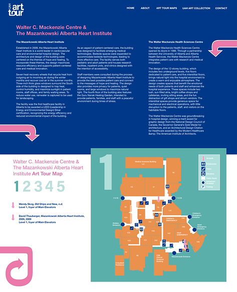
The goal of the map is to act as a tour guide, taking the viewer/user floor to floor, artwork to artwork. I believe it is important to have a map in this hospital setting to encourage movement and be in the moment with family/friends. As well, not everyone at the hospital has technology (older patients) and maps allow everyone to be included in the tour.
I chose to design two maps; one map for the Walter C. Mackenzie Centre and The Mazankowski Alberta Heart Institute and a second for the Kaye Edmonton Clinic. I chose to incorporate the Walter C. Mackenzie Centre and The Mazankowski Alberta Heart Institute together because the example maps given, were essentially the same and the buildings are closely connected. Further, having two separate maps made it easier to read the information that is essential to the art tour.
The map is printed double sided on legal size paper (thinner card-stock paper). This is cost effective and the size allows for optimal usage. The map is folded into three panels. The two map’s exteriors are different in color, but contain the branding elements (logo, arrows and artwork). When the map is opened, the viewer is given a short introduction of what the tour is and what it consists of in-order to give the viewer insight.
When fully opened the user can see all floors that include art that is on the tour. The map’s floors are in isometric view, to allow the viewer to understand that the tour is on different floors of the hospital. I included room number, building/room names, stair/elevator symbols and washroom symbols to help orientate the user. Additionally, I included a key to further help the user navigate the map.
The large numbers on the left hand side of the map indicate the floor level. The artwork is indicated by an arrow (a graphical element of the system). The is easy to understand and points to artwork.

Maps outside view
8.5 x 14 inches

Maps outside view
8.5 x 14 inches

Floor Sticker, 11 x 14 inches

Maps inside view mock-up
8.5 x 14 inches (4.6 x 8.5 inches when folded)

Maps outside view mock-up
8.5 x 14 inches (4.6 x 8.5 inches when folded)

Maps inside view
8.5 x 14 inches

Maps inside view
8.5 x 14 inches
Promotional Item: Floor sticker
To encourage and promote the art tour, vinyl floor markers will be placed on the floors around the public halls of the hospital. These floor stickers are the logo of the tour, with an extended arrow pointing in a direction, with the words “follow me!” Someone walking around the hospital (staff, patients, family or friends) might see the sticker and be interested in the tour or be directed on their search for the next artwork on the tour. I researched adhesive stickers and vinyl decals that are made for high traffic floors. These materials are easy to install and change if needed.

Landing Page
Website
The web pages follow the visual system in-regards to design, colours and branding. The landing page includes an introduction statement about the tour and what it consists of. This page also includes artworks on the tour that circulate as the viewer is on the page. This page uses buttons to prompt the user to explore the maps and art collection. In addition, the webpage has a digital version of the map. Like the physical maps, there are two separate pages. One for Walter C. Mackenzie Centre and The Mazankowski Alberta Heart Institute and a second for the Kaye Edmonton Clinic. These pages have text about each building, a map and the list of artworks in that building. When the user scrolls down the page, they will be able to view the map levels one by one. The user can click the numbers to change levels. Each floor shows the corresponding artworks located on the floor. The user can click the artwork arrow to be taken to another page with a photo and additional information on the artwork. This page will be labeled by building and level. When an artwork is clicked on the map page, the user will be taken directly to that artwork.

Landing Page

Map pages

Art work page
Project Reflection
In this project, I learned a lot about designing for medical cliental, and creating and delivering client presentations. I learned that it is important to come to the client with a few different developed ideas. The client will not always choose the idea you think they will. One of the biggest take aways from this project was learning how to design a map for complex building systems. I focused on creating a map that was easily read and understood by all, and something that was visual fun that fit within the visual system I designed. Working with the University of Alberta Hospitals was a great learning opportunity as a designer.